Using multiple class-based CSS transitions to create staged animations
Published
CSS transitions are pretty awesome. They're straight-forward to write, supported by all modern browsers, and add a bit of interactivity without the need for JavaScript (save some adding or removing classes).
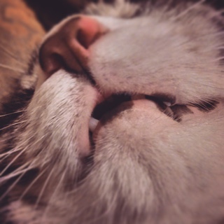
In a nutshell, they're a way to animate the change in value of a property of an HTML element. So say you have an image, such as the one below with the class of .kitten, and you want it to fade out on hover, you could add a rule to the :hover pseudo-class that goes something like:
...and our kitten will fade out like this (hover your mouse on Tiger [sorry, mobile peeps, but if you tap Tiger, he probably won't come back]):
Internet, meet tiger.
But, you may have noticed that while our kitten fades out on hover, it pops back in on mouseleave. Why? Because our transition is tied to the :hover state, so when our mouse leaves the image, we go back to .kitten's lack of transition, which is a delay of 0 seconds, and a transition time of 0 seconds. In other words, no transition.
That's actually a pretty cool because it means we can give our elements different transition properties based on their class (or pseudoclass). That gives us the ability to have different animations depending on whether we're adding or removing classes, kind of like this:
Mmm, class-based animations.
So, what's cool about that? Well, aside from the bit of JavaScript we're using to toggle the .animate class in the figure above, the animations are all just CSS transitions. The markup for this is just:
1<figureclass="demo">2<divclass="circle item-1"></div>3<divclass="circle item-2"></div>4<divclass="circle item-3"></div>5<divclass="circle item-4"></div>6<figcaption>Mmm, class-based CSS animations.</figcaption>7</figure>8<buttontype="button"class="demo-button">Toggle the thing!</button>9
So, what's our CSS doing to create this effect? First, let's look at the CSS in its entirety.
1.circle{2background-color:#b266ff;3border-radius:50%;4height:40px;5left:0;6margin-bottom:10px;7position: relative;8transition: left 2s ease-out;9width:40px;10}1112.animate.circle{13left:90%;14transition: left 1scubic-bezier(0.68,-0.55,0.27,1.55);15}1617.animate.item-2{18transition-delay:0.5s;19}2021.animate.item-3{22transition-delay:1s;23}2425.animate.item-4{26transition-delay:1.5s;27}28
Now, let's walk through each piece
1.circle{2background-color:#b266ff;3border-radius:50%;4height:40px;5left:0;6margin-bottom:10px;7position: relative;8transition: left 2s ease-out;9width:40px;10}11
So here's where we turn empty div.circle's into 40px by 40px purple circles. We also explicitly define a few things that make this whole effect possible.
For one—and most importantly for the topic at hand—we set the default transition property for our .circle's to all 2s ease-out. For context, transition is a shorthand property that defines a few things, such as what property we're setting the transition for, how long the transition should take, what (if any) delay there should be before our transition begins, and what easing function should be used to transition between the two values. Learn more about it on the Mozilla Developer Network.
So, why did we define it here? Well, remember our cat up there? If we didn't define the base state, then when we toggled off the .animate class, our circles would immediately jump back to their initial state without that smooth transition effect we're going for. We want the default transition to apply to the left property, transition over 2 seconds, and use a ease-out transition-timing-function. Again, transition is a shorthand for all of these individual properties.
Which leads us to the next thing we're doing. We're explicitly defining left: 0 because without it, our browser wouldn't know what value to transition the left property from, to our final state of .animate .circle { left: 90% }. Why do we need it? Well, left's initial value is auto, which is not a numerical value. Again, remember Tiger the cat? We didn't need to explicitly define his opacity because opacity's initial value is 1. In order to use the transition property, your starting and ending values need to compute to a numerical value, or your browser won't know how to go from one to the other.
And, finally, we're giving our .circle's relative positioning so we can actually move them using the left property.
1.animate.circle{2left:90%;3transition: left 1scubic-bezier(0.68,-0.55,0.27,1.55);4}5
Once we add the .animate class to our containing figure element, we're going to move our circles over to the left by 90%. We're also going to overwrite the transition property of our .circle's to something that's a little faster and more bouncy. We're bringing the transition-duration down from 2s to 1s, and we're going to switch up the transition-timing-function to a custom cubic bezier curve we made in Chrome's dev tools.
A quick note about that, in the more recent versions of the Chrome inspector, when you have an element with a transition property, you'll see this little square with a squiggly line in it. If you click that square, you can actually edit the bezier curve visually and copy its values to use in your CSS.
Chrome inspector's bezier curve tool
For me, it's a lot of trial and error, but you can get some pretty complex animation curves out of that thing.
This is pretty self explanatory, but we're setting a delaying the animation for some of our items. Because the default transition-delay is 0 and we want the animation to start when we click the button, we don't need to worry about setting a transition-delay for our first item. We did set one for items two through four, incrementing each by half a second. That way, we get that staggered effect where each item starts moving a little after the one before.
So that's it! When our figure has the .animate class, we stagger the delay of the transition, and use a bouncy bezier curve we made with Chrome's inspector (love you, Chrome!). When we remove the class, our .circle's animate back with their simultaneous less bouncy transition.
One last thing I want to mention is that you can stack values for the transition property, meaning you could have specific delays and timing functions for different properties you're animating. Hover over this red square for an example.
This ain't pretty, but what's happening is pretty interesting
So we have a 100px by 100px red div. On over, we're making it blue, and upping its size to 200px by 200px. Finally, in our div.example:hover rules, we have multiple values for the transition property for each of the properties we're animating. Take a look at the height rule. Notice how it has two 1s values? We haven't seen transition-delay in a shorthand property in this post, but it can be passed to transition as a 2nd duration value, after transition-duration. Pretty neat stuff!
CSS transitions are pretty neat things, and by setting different durations, delays, and timing functions, you can create complex animations rather easily. I hope this post was valuable to some of you. I hope you enjoyed this. Let me know your thoughts or teach me a thing or two about CSS animations by contacting me Twitter at @ddggccaa.