Creating an Apple Watch notification mockup with Origami 2.0
Published
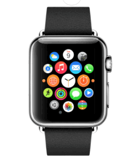
I've been working on a mockup which goes through the Apple Watch notification process, from the Home Screen, to a Short Look Notification, to a Long Look Notification, and back to the Home Screen. I took this on because it had been a while since I had put something together in Quartz Composer using Facebook's Origami library, and because the Apple Watch is coming out this month (exciting stuff, even for an Android person like me :-D).
So, where do you fit into this post? Well, I created this Apple Watch notification composition in a way that would let you replace the images I'm using with your own, so that you can mock up what an Apple Watch notification could look like for your iOS app. All you have to do is replace my images and adjust a few values.
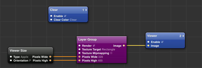
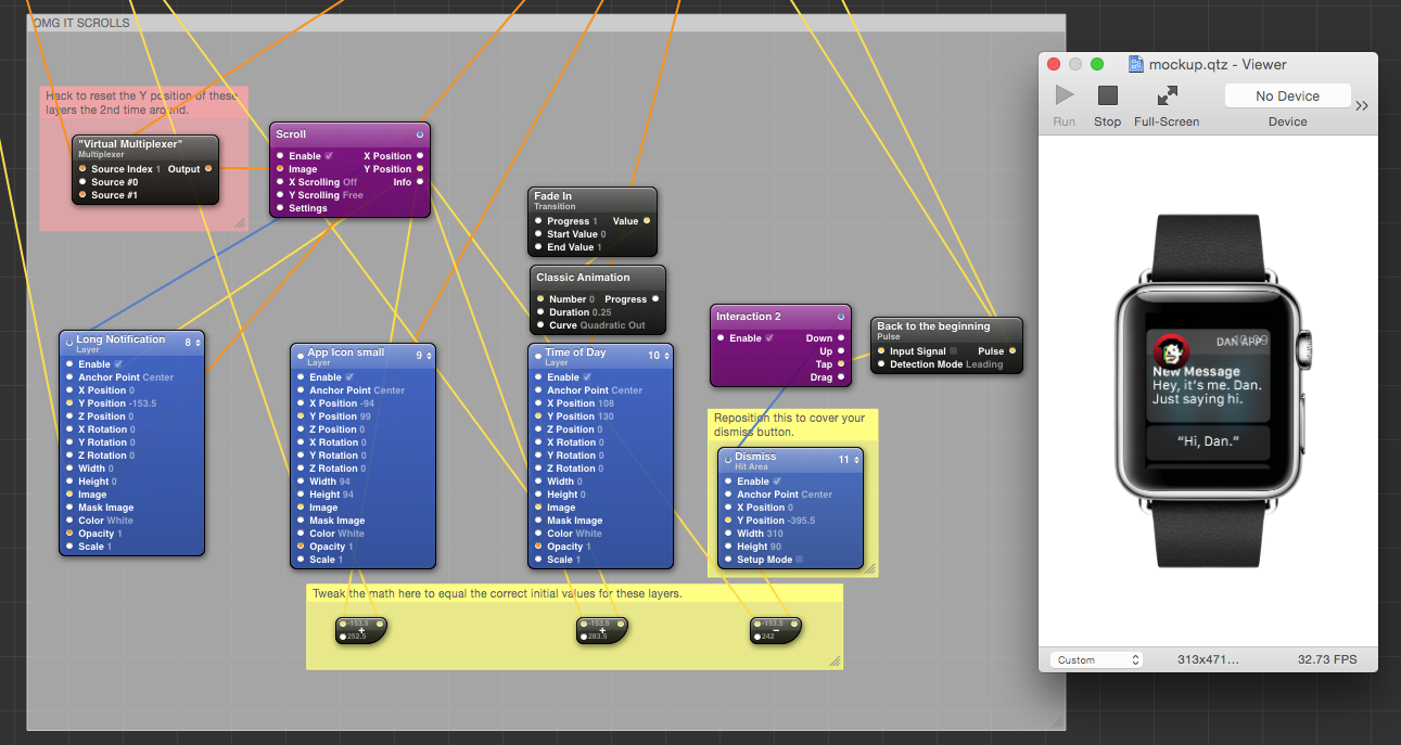
The base composition looks something like this:
If you're new to Quartz Composer and Origami, I wrote an introductory guide about a year ago when Origami first came out. I recommend you go through it to get a feel for what Quartz Composer is, and what Origami brought to the table in terms of added functionality.
Before we get started, a few notes. The following assumes that you're somewhat familiar with Quartz Composer. It doesn't have the most intuitive interface, and can be finicky at times. I'm sure you can get through this as a first-timer, but it might be a little overwhelming at first. Another note is that, to be honest, it's not as pretty as I'd like it to be. While putting compositions together, I've found that Quartz Composer is a somewhat poorly documented piece of software. There's a couple places where I knowingly hack stuff together, which I call out in big red notes. If you guys have any suggestions on how to fix these areas, I would really appreciate it. Tweet at me @ddggccaa with your ideas. Finally, in order to follow along, you'll need Quartz Composer and Origami. Follow Facebook's 3-step process to get hooked up with that.
Okay, let's begin. First, download the source files. I've got everything up over on GitHub. Just head over there and click 'Download ZIP' or clone the repo.
In the 'Images' folder, you'll find all the images which make up our composition. It's up to you to update these images as you see fit in order to make your own animation. There's even a Sketch file which you can edit and use to export all these images with matching names and image sizes.
The image sizes are very important. In the composition, I'm using the image sizes as they are. That means that when a layer patch's width and height is 0, it's actually whatever the image's normal dimensions are. For best results, use the same image sizes as you see here. There is one exception, and that is the Long Notification. While your Long Notification image should stay the same width, the height will likely change in order to accommodate your custom notification message and options. We'll cover how to tweak the composition to account for those changes in a bit.
Okay, so at this point, you should've made some edits to the images, and we should be ready to dive into the actual composition.
Extract the files and open up 'mockup.qtz'. You should see the following patches. Also, because Quartz Composer tends to be a bit on the heavy side in terms of processing, you probably want to stop your viewer.
Double click into Layer Group. There's a lot going on here, but for our purposes, we only need to focus on the patches with yellow notes along the left side of the composition, and on the bottom of the composition.
So, to break down what's going on here, I've clustered patches into gray notes. The gray notes are the four major interactions that are at play. From the top, we have:
- The Home Screen (this one is nice and easy to follow)
- The Short Look Notification
- The transition animations into the Long Look Notification
- The Long Look Notification
Basically, when you tap anywhere on the Home Screen, we trigger the Short Look Notification animation. Then, after 2.25 seconds, we trigger the transition animation. Once the transition animation is done, we make all the assets scrollable. Finally, when you tap the 'Dismiss' button, we go back home and we can do it all again. Cool, huh?
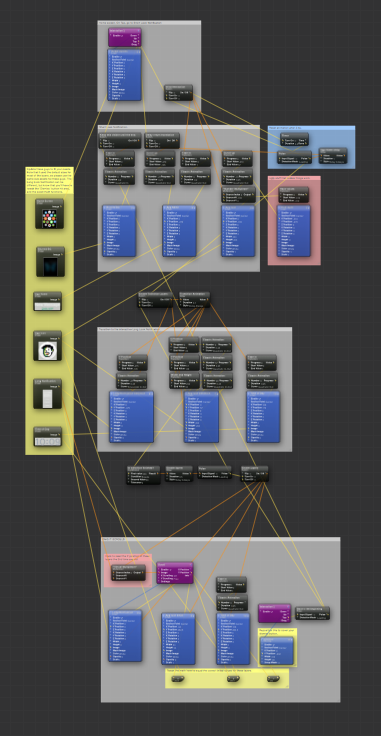
Okay, so on the left and on the bottom, there are yellow notes. In these notes are the patches we'll be editing. Just an aside, you're probably fine leaving the Home Screen, Blurred BG, and Time of Day images alone, since those are fairly standard.
Okay, let's swap out my DAN APP App Name for yours. Click the App Name Image patch, and click the Patch Inspector icon in the menu bar. In the inspector, you'll see a drop-down menu that reads 'Input Parameters'. Click the drop-down and select 'Settings'.
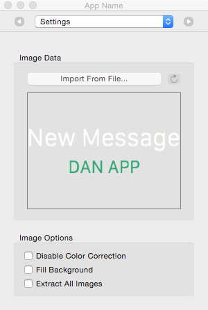
See that 'Import From File...' button? Click that guy and hunt down your new App Name. When you replace the App Name image with your own, you should see the changes reflected in the inspector. Remember when I said QC was finicky? The image displayed in the actual patch itself won't update until you repoen Quartz Composer. Don't worry, though. When you view your composition, your new App Name should display properly.
So swapping out image assets is pretty easy, right? Do the same thing for the App Icon and the Long Notification images.
Did you use a Long Look Notification image that was a different size than the one I used? If not (which, to be honest, is surprising), you're done! Good job. Run the viewer, hit play, and watch your composition go.
Did you use a different sized Long Look Notification image? Let's make some tweaks so that everything is working correctly.
Okay, so I'm going to guess that you made the Long Look Notification longer and now your header icon and the time of day are dropping down. If you made the Long Look Notification shorter, then the header icon and time of day should be getting bumped up. Either way, it's something we need to fix.
See the yellow note at the bottom of the composition that has some math patches in it? We're going to adjust the second value to make sure our icon and time of day get the right Y Position when this final block of code runs.
In the 'OMG IT SCROLLS' block, when we first get to this block, our 'App Icon small' layer's Y Position should be 148, and our Time of Day layer's Y Position should be 179.
Since these patches are scrollable, and that scrollability is tied to the Long Notification layer's Y Position, when our Long Notification image changed sizes, we introduced a bug.
The easiest way to fix this is to run your composition, click the Home Screen, and wait for the animations to run their course. When we get to the end, make a note of the Long Notification layer's Y Position.
For example, my Long Notification's Y Position is -153.5. Now we need basic algebra, woo! Okay, so we want to get to:
- 'App Icon small' Y Position: 148
- 'Time of Day' Y Position: 179
So I can do -153.5 + X = 148 and I get 301.5. So to fix my 'App Icon small' layer, I'm going to click the Math patch that's right under it, and adjust the 2nd value to 301.5.
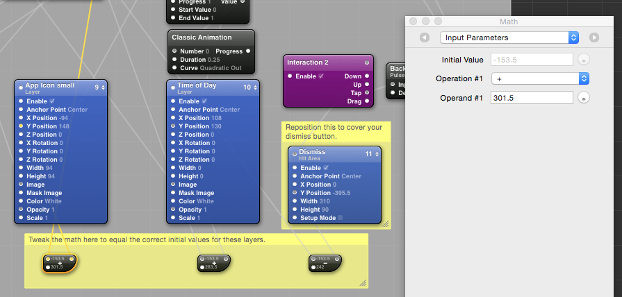
Easy? Good. Do the same for your 'Time of Day' layer and run the composition to see if everything looks okay.
There's one last thing we need to do, and that is to adjust the Dismiss Button's Hit Area position so that when we hit the Dismiss button, we go back to the Home Screen.
Okay, so the Dismiss Button isn't really a button. We're placing an invisible area (the Hit Area patch) on top of the image where the Dismiss Button is and using that as our trigger for going back to the Home Screen. Click the 'Dismiss' Hit Area patch and go into the inspector. The last option in the inspector should be 'Setup Mode'. Click that checkbox to turn on Setup Mode.
Run your composition, click the Home Screen, and let the animations play out. With the Hit Area's Setup Mode turned on, you should be able to see it as a semi-transparent red rectangle. You might have to scroll to see it.
You're going to need your viewer and your inspector for this one. Scroll your viewer until you see your Long Look Notification's Dismiss button. Click the Math patch under your Hit Area and bring up its inspector. Note that this is a subtraction patch, so the more you increase the number, the lower your Hit Area patch will go. Tweak the 2nd value in the math patch until your Hit Area is right over the Dismiss button. Once you have that, inspect the Hit Area and turn off Setup Mode.
Guess what, you're done! When you run your composition, clicking anywhere on the Home Screen should trigger the notification with your app icon, and you app's name. Once you click the 'Dismiss button', the interaction should start over, and you should be able to run through everything again.
Was this useful and easy to follow along? Let me know @ddggccaa. I would love to see any mock notifications you make, as well.
<3 Dan